 Creating a Chart Report
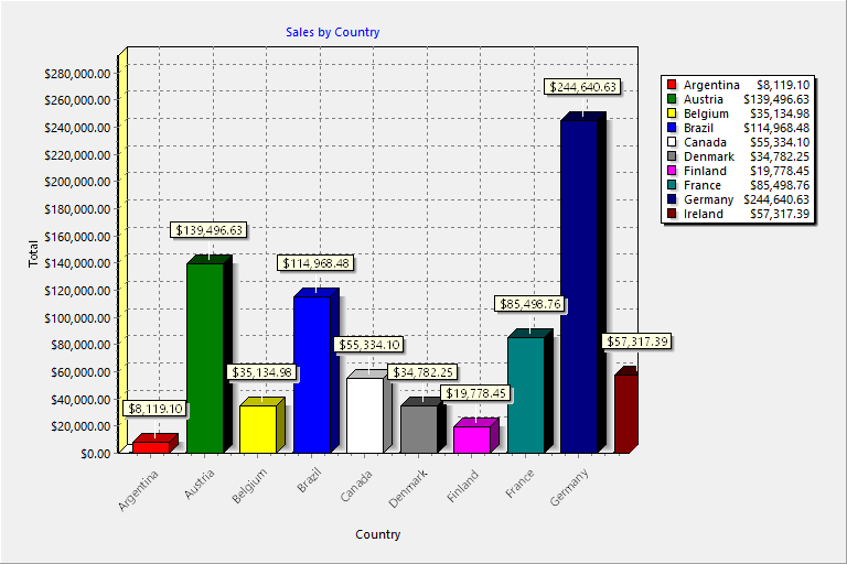
Stonefield Query can create charts and graphs from data in your database. For example, you may want to see a breakdown of your sales by product. You can graph this information as a pie chart, a bar chart, or one of the other chart types to suit your needs. Here's an example of a chart:
To create a chart report, select at least two fields you want to appear in the chart, and then select where each field goes. There are three places a field can appear:
A category field appears in the category, or X, axis of all but pie charts. For pie charts, a category field is used for the slices. For example, to show a chart of sales by product by year, use the product name as the category field.
A values field is the numeric value for each category item in the chart. For pie charts, this is used to determine the size of a slice. For all other charts, it's used for the values, or Y, axis. For example, to show a chart of sales by product by year, use the sale amount as the values field.
A series field is used to create multiple charts. For example, to show a chart of sales by product by year, use the sale date as the series field and display the year rather than individual dates using the Properties dialog. Not all charts have a series field.
Here are some notes about how charts work:
You can specify how the values field is summarized. For numeric fields, the default is to sum the values. For all other types of fields, you can only have it count the number of values.
If you use a date field as the category or series field, you can specify how the date is displayed. For example, you may want to show the month or year rather than individual dates.
Series are optional. If you don't specify a series field, the chart only has one series.
To create a chart report, follow the steps in the Creating a Report topic. The Chart Wizard shown below appears.
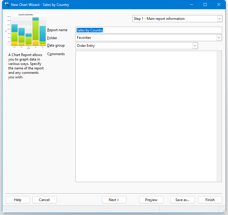
You can resize the Chart Wizard window by clicking the lower right corner of the window and dragging until the window is the desired size. You may wish to size the window fairly large so the chart shown in Steps 3 and 4 of the Chart Wizard appear at a reasonable size. Stonefield Query remembers the size and position of the Chart Wizard and restores it the next time you run it.
© Stonefield Software Inc., 2025 • Updated: 01/26/21
Comment or report problem with topic